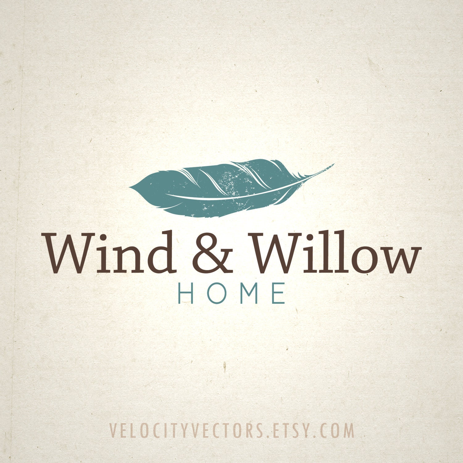
I have been working with Ariel Tyndell of Velocity Vectors on a new logo and image for Wind and Willow Home. We have come up with some fantastic designs that portray the simplicity and timelessness of nature inspired living. Ariel is a graphic design student at Middle Tennessee State University working on her BFA in Graphic Design. I found her through etsy (yep, did you know you could find graphic artists through etsy). Immediatly I was struck by her modern yet organic style. She had many images of her work and they were just the style I was looking for. So, I decided to take the leap and partner with Ariel to create the image that Wind and Willow Home will be recognized as from now on.
Let me say, that is a lot of pressure. Image is so important these days and it was important to me to portray one of professionalism that incorporates the visual sense of our products and designs being timeless, high quality, comfortable and of course related to nature.
I started this process by filling out a brief questionaire so she could get an ideas of what I was looking for. I answered questions like, "give me a brief history of your company". I threw around ideas for the image such as a tree, leaf or bird. We landed on the feather for it's simplicity and vision of comfort. Next she took that information and came up with 5 different logo ideas. This is where it became difficult. They were all beautiful and interesting in their own way, so how to decide. Well, one of them had that perfect mix of modern and organic that I had been looking for. From here we did some color tweaking. Again, this was a tough decision because there are so many color choices and with my background in interior design I couldn't stay away from color psychology. Should I use yellow to portray energy, green to portray a fresh approach or grey to keep it trendy. As you will see we landed on blue and brown which is the perfect mix of serenity and comfort.
All in all this process has been truly rewarding but it hasn't been completely easy. During this process I have learned just how important, and difficult it was to stick to my original vision. It has taken about 2 weeks of multiple emails back and forth, trying different font styles and colors along with adjustments and readjustments back to the original images. Ariel has been patient and professional. Finally SUCCESS, we have landed on the final logo and I am happy to share that we will be updating the blog and other social media with the new images soon.
What do you think of the logo? Love it, Like it...? Please share with your comments below.


No comments:
Post a Comment